
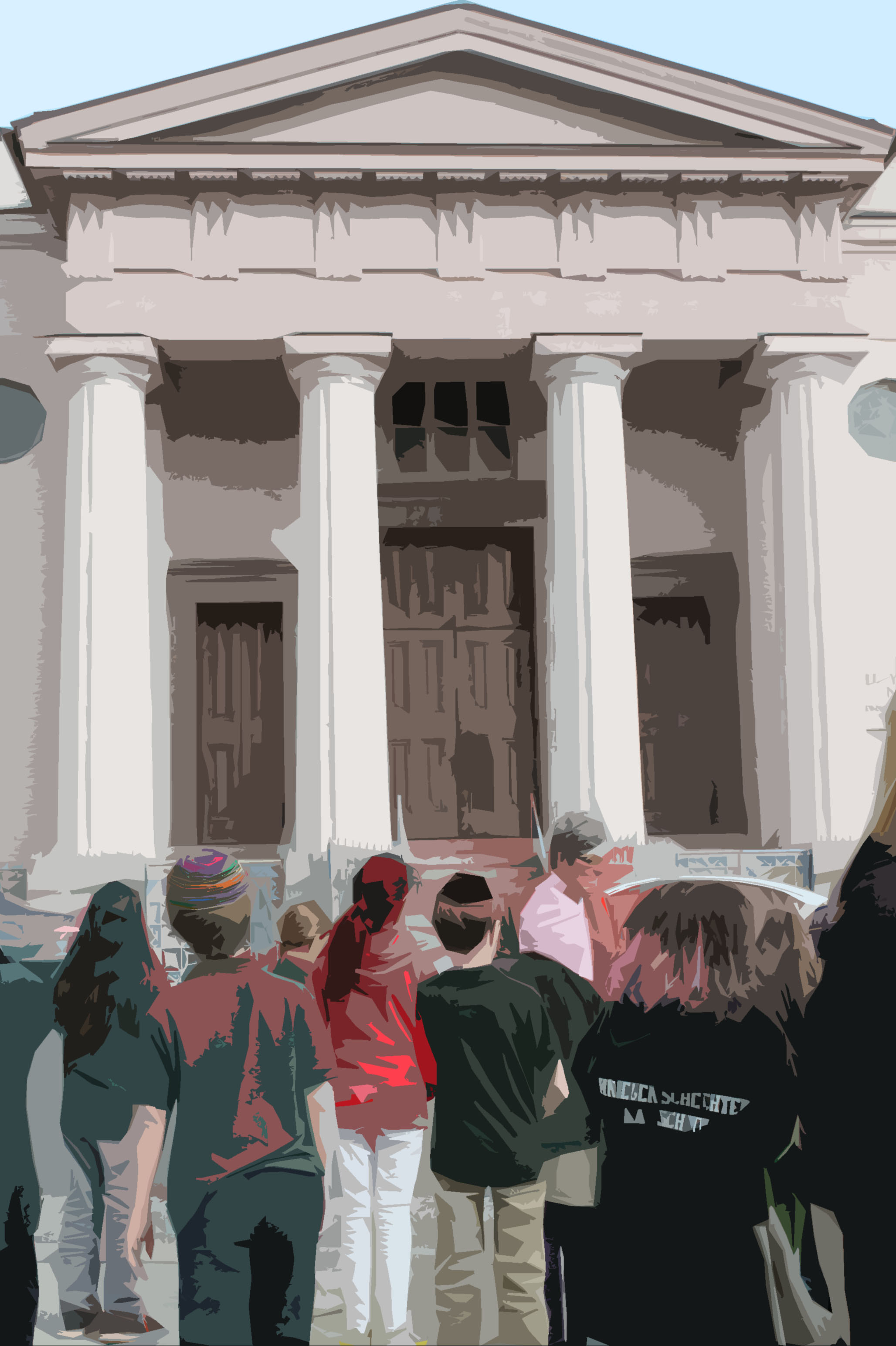
Intern Weekly Response: Museum Accessibility
Every week we’re asking our summer interns to share some thoughts and responses to various experiences and readings. This week we asked them to reflect on a recent Museum Accessibility workshop led by our visitor services coordinator Paige Woodhouse and to read and respond to a selection of articles – including suggestions for JMM to apply. To read more posts from JMM interns, past and present, click here.
Museums and Accessibility: What’s in a Label?
~Intern Cara Bennet
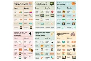
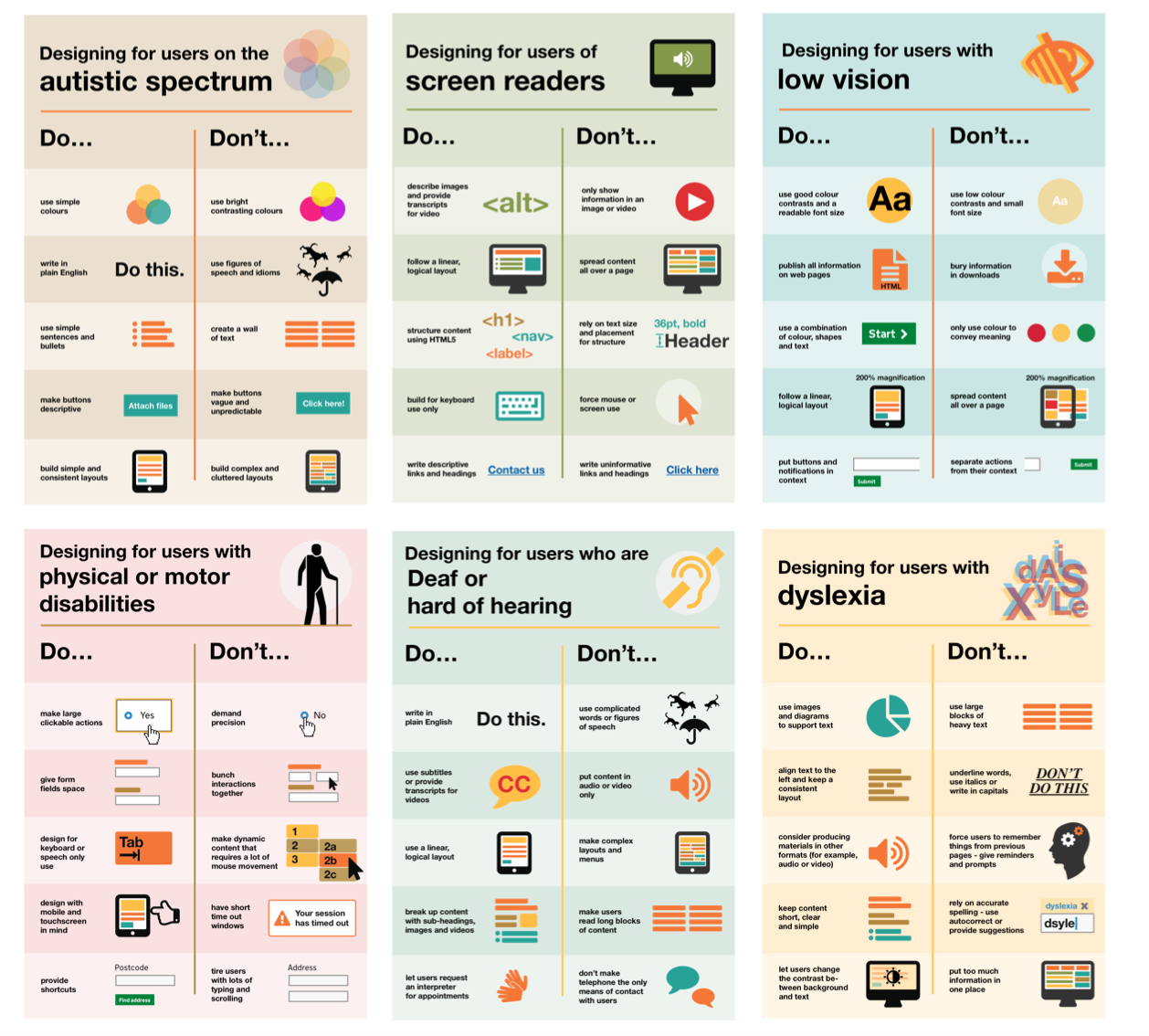
Labels play a huge role in making museum exhibits accessible to a diverse audience. A label’s content, language, format, and style all have an impact on a visitor’s experience and their ability to understand and retain the information being presented. As I’ve learned through my museum studies courses, the best labels use clear, concise, simple language that can be understood by visitors of varying age ranges and educational backgrounds. The Smithsonian’s guidelines for accessible exhibit design argues for the use of active voice in labels, explaining that “people who have difficulty reading English are most successful when the active voice is used in short sentences. Subject-verb-object sentence structure ensures better understanding.” While many of the JMM’s individual object captions in its permanent exhibit “Voices of Lombard Street” are clear and concise, many of the exhibit’s introductory text panels are quite long and wordy. These panels also use words that may be unfamiliar or difficult for some visitors such as “artery” or “knell.”
Label styles and formats also play an important role in making an exhibit accessible to a wider audience. Many museums offer labels in braille and other languages for people that have vision impairments or are non-native English speakers. Even small design details like font type, size, spacing, and color contrast (all things I’ve never really considered before) play a huge role in making labels more accessible for visitors with disabilities.
While the JMM has done a great job making its accessible by offering large print and braille exhibit guides, I would suggest making the following changes to make its exhibits even more accessible to visitors. In addition to offering large print and braille exhibit guides, the JMM should also offer visitors exhibit guides in foreign languages. Currently these guides are kept at the front desk and must be requested by visitors. I would suggest that the JMM make it clear that these guides are available either by displaying them at the exhibit entrance or posting signs near the exhibit entrance notifying visitors that these guides are available. I would also suggest that museum includes braille and foreign language labels within the actual exhibit, but I understand that working with a small museum’s budget and limited exhibition space this isn’t always an option. I would also suggest that the JMM simplify and condense some of the text panels in its permanent exhibit to make the content more accessible to a wider audience. I would also suggest that the JMM replace all low-contrast labels to make them easier for all visitors to read.
Website Accessibility
~Intern Alexia Orengo Green
Museums are the perfect place to learn about a topic, increase your interest, or admire a piece of art. For many, museums are places where they can enjoy themselves while engaging in a learning environment. But, even though for some, museums are safe heavens others feel excluded because of the lack of accessibility these have.
Last week, we had a Museum Accessibility workshop with Paige Woodhouse. There we learned the different types of accessibility that museums need to have, and methods museums are using to become inclusive to all. On the workshop we also learned how the JMM is accessible and its plans to grant accessibility to everyone, making their experience more enjoyable.
One of the ways in which the JMM is planning to become more accessible is through its website. Most of the visitors of the JMM access the website to learn about the different exhibits and events happening in the museum. Because of this, it is important that everyone can engage with the website in a comfortable way.
Underneath is a list of suggestions for the new JMM website that I created following the recommendations from our workshop and readings.
List or Recommendations:
1. Bigger Text: For people who have vision impairments, such as poor vision, it may be difficult to read a small font size.
2. Night mode: The bright colors of the page might give headaches to people with vision impairments or suffer from migraines.
3. Declutter: Decluttering the page may help people, for example, with ADHD to focus better while visiting the page.
4. Underline hyperlinks: Underlining the hyperlinks would make the website’s experience for people who are color blind better by not relaying on color.
5. Smaller paragraphs: Having smaller paragraphs on the website may also help people to focus better while reading the website’s information.
Accessible Websites and The JMM
~Intern Ash Turner
Good website design can sometimes be underappreciated. As Jared Spool, a writer and researcher, states, “Good design, when it’s done well, becomes invisible. It’s only when it’s done poorly that we notice it.” And poor design negatively affects a website’s accessibility and usability.
This week, I did my readings on website design and accessibility. I found that there are a lot of checklists and articles about creating more readable and accessible websites. There are articles on different disabilities, and how to best design for them. They range from overall best-practices articles such as this one, to articles that are more specific, such as this one about designing for color-blindness.
The key trait for all good web design, though, seems to be clarity. Pages need to be simple and clean, from their font and color choices, to the language used, all the way to the layout of the page and its navigation. There are other things to keep in mind as well for website accessibility, such as having image descriptions for photos, captions or transcriptions for video content, and multiple ways of understanding the content for all pages.
After my research, I have a few suggestions for improving the accessibility of the Jewish Museum of Maryland website:
>Simplify and clarify the navigation
-This includes using less colors and more consistency, and underlining or differentiating links from other non-clickable text
-Declutter the navigation by making sure it’s all in the same area and easily findable
>Use larger font sizes (for both computers and mobile)
-As stated in this article about readability on websites, larger font sizes increase text readability for all users, not just those that are vision-impaired

>Use a mix of media to convey information
-Using different types of media (such as video, sound, or images along with text) gives people the option to understand content in different ways
-For example, the museum location page could include a small map graphic for visual understanding
>Think about changing the body text font to sans-serif
-Fonts that are more common are easier to read, and sans-serif fonts are most common on the internet for body text
>Test the website with different people
-This is especially important, since all good design should be centered on actual people
-Make sure to test with those who use assistive technology
-As the accessibility blog on Gov.uk states, “Testing with people who use assistive technology can be a quick and effective way of identifying issues that affect all users”
Overall, increasing accessibility through web design can only create a better experience for everyone.
Avoiding Stagnation
~Intern Marisa Shultz
While closely considering accessibility for this week’s intern response – I say closely because accessibility is something we should be considering often – a quote from Mary Ann Wojton, Joe Heimlich, and Natalie Shaheen’s article: “Accommodating Blind Learners Helps All Learners” stood out:
“Museum Educators generally design educational programs that they believe accommodate all visitors.”
What is so essential about this quote is that it emphasizes that museum educators believe they have accommodated all kinds of visitors, implying two things. First, that museum educators have not been as successful in this endeavor as they perceive, and second, that some museum educators may be stagnant because they feel a permanent and fulfilling solution has already been found and implemented.
The museum has an excellent tour of the Lloyd Street Synagogue and B’nai Israel, but we do not have staff members and docents trained in American Sign Language (ASL). This lack of ASL trained staff and docents may make Deaf visitors feel alienated. While the ideal solution is to have two ASL trained staff members or docents on site each day (one to accommodate Deaf visitors at the front desk and another on the Synagogue tour), I feel this may not be a realistic goal in the short term. Perhaps instead then, we can approach this in a two-pronged manner. If we could hire (or train) a staff member or docent who knows ASL, we could schedule and advertise multiple ASL tours each week at a variety of times corresponding with the work schedule of the staff member/docent.
Additionally, our website has a section devoted to accessibility with our wonderful Paige Woodhouse as a contact; perhaps members of the Deaf community could schedule ASL tours on dates and times that are most convenient for them (barring of course, when the museum is closed). If it is not possible to hire (or train) a staff member/docent with ASL skills, perhaps it would be possible for the museum to pay for an interpreter; however, this would require a prior arrangement, and we should be striving to be accessible to all visitors, all of the time.
It is also important to note, that not all members of the Deaf community know ASL; therefore, these accommodations would only make the museum more accessible to some members of this community. Perhaps then, we could work in conjunction with an organization such as the National Association of the Deaf (NAD) to create accommodations based around the community’s knowledge and experience, in order to create a more accessible environment.
Consider a Touch Tour
~Intern Ellie Smith
Accessibility should be a high priority for all museums. Accessibility allows for diverse audiences to patron museums and enjoy the museum community. For those with disabilities museums may not be the most welcoming place but as museum staffers we need to work hard to improve our accessibility standards so that everyone who comes to a museum can enjoy and benefit from it. Issues of accessibility range from having wheel chair ramps to providing noise canceling headphones for those with auditory sensory issues. Patrons with sight impairment or blindness need different experiences than other patrons. Museums like the Smithsonian and many others provide verbal description tours and touch tours. Verbal description tours are led by a docent who provides extremely detailed descriptions of objects that are in the museum. Docents not only describe the objects they also provide historical context and other information about how this object relates to the exhibit and the museum. Touch tours are tours where patrons wear special gloves and are allowed to touch the objects on display while a docent provides a verbal description. The Smithsonian has set a high standard for touch tours as described in their “Guidelines for Accessible Exhibit Design”.[1] This resource is available online and provides an in-depth look at how a successful museum provides the highest in accessibility standards.
Other patrons may require other forms of accessibility. Patrons who are deaf or have hearing impairment need videos with captions and transcriptions of any verbal pieces of exhibits. The Smithsonian takes great care to ensure that all patrons are able to experience the exhibits to the fullest. Another exhibit that has taken great care in making sure it is accessible to diverse audiences is Nano which is an interactive exhibit “designed by the Nanoscale Informal Science Education Network.”[2] The designers of Nano worked to create an exhibit that has different pieces that patrons with different skill levels can interact with. Instructions for these activities are written in both braille, English, and Spanish. They are also in video form with captions. And there are also demonstration videos. Interactive parts of the exhibit are placed at different heights so children as well as those in wheel chairs or short people can access them. Nano is a prime example of an accessible exhibit which allows diverse audiences to participate.
I believe the Jewish Museum of Maryland could benefit from adding a touch tour to our exhibits. The Voices of Lombard Street exhibits lends itself well to a touch tour because it already has so many interactive pieces.
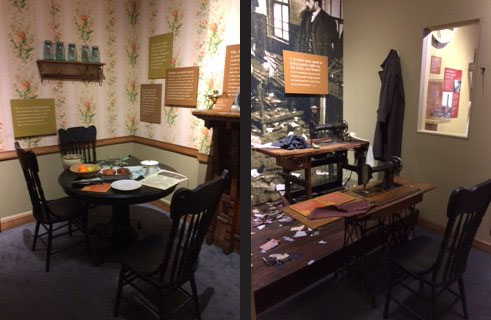
While this is taking place a docent can provide a verbal description of what the patron is touching and then tell the history of the garment industry in Baltimore. With new exhibits we should work hard to make sure that a touch tour can occur. Along with this we should also consider providing an audio tour that patrons can use independently and training docents to provide accessible tours. By improving our accessibility standards we can accommodate a more diverse audience and create an overall better museum experience for patrons.
[1] https://www.si.edu/accessibility/sgaed
[2] Rae Ostman and Catherine McCarthy, “Nano: Creating an Exhibition that is Inclusive of Multiple and Diverse Audiences”. Exhibitionist, fall 2015.